Most of your customers search on their phones, yet many people doing SEO still only check rankings on a desktop computer. The two numbers are often not the same, and the gap can sometimes reach ten positions or more. If you only look at desktop rankings, you may feel reassured by a great position that real customers on their phones never actually see. This article explains why mobile rankings differ from desktop, and how to track both properly.
Why do rankings on mobile differ from desktop?
Google indexes the mobile version first
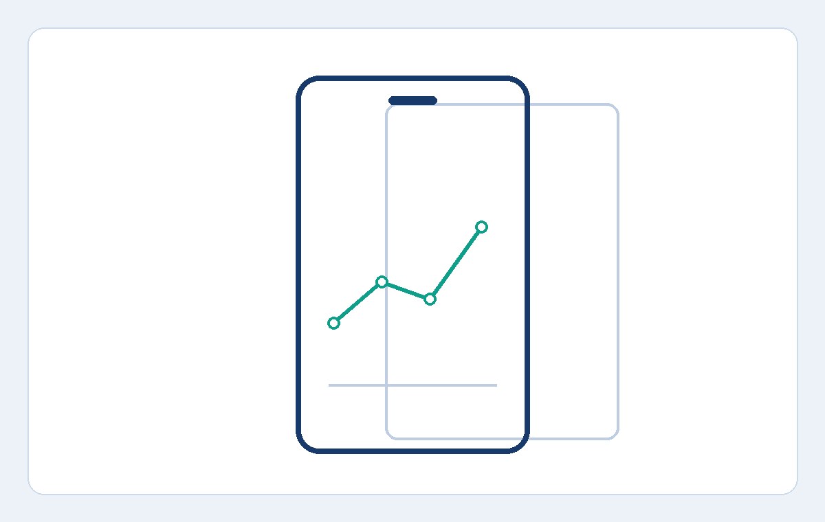
Google switched to mobile-first indexing a long time ago: the mobile version of your website is the primary basis for indexing and ranking. If your mobile pages trim content, hide important information, or load more slowly than the desktop version, your mobile rankings will reflect exactly those shortcomings — even if the desktop version looks perfect.
The search results layout on phones is completely different
On a small screen, blocks such as local map results, videos, images, and featured snippets take up a much larger share of the visible space than they do on a computer. A page sitting at position 4 on desktop can be pushed below an entire map block on mobile, forcing users to scroll quite far before they ever see it. In other words, the same "position" can mean a very different chance of actually being seen.
The search context of mobile users is different
People searching on a phone are often on the move, need results near where they are standing, and want to act fast: call, get directions, order right away. That is why results tied to location and immediate needs get prioritized on mobile. For the same keyword, rankings can shift simply because the device brings a completely different context with it.
Mobile results are also shaped more strongly by location
Because a phone knows where its owner is, local results play a bigger role on mobile than on a desktop sitting in an office. A shop, salon, or repair service can rank noticeably higher for a searcher standing two streets away than for the same search done across town. This is one more reason a single desktop check can give false confidence: it hides the local competition your customers actually face when they search near your business.
Even the meaning of "visible" changes on a small screen
On a desktop monitor, the first four or five results often fit on one screen without scrolling. On a phone, an ad block, a map pack, and one or two results can fill the entire first screen. So a page at position 3 on mobile may still sit below the fold, while position 3 on desktop is plainly visible. When you compare devices, you are not just comparing numbers — you are comparing how much real attention each position can earn.
What happens if you only track desktop rankings?
- You misjudge your SEO performance: reports look great on desktop, but most of your traffic comes from phones and is not growing.
- You miss problems with the mobile version: tiny text, buttons packed too closely together, pages loading slowly on mobile networks — all of these only surface when you look at mobile rankings.
- You optimize in the wrong direction: you keep improving things that only affect the desktop experience.
- You cannot answer customers' questions: a client tries searching on their own phone and does not see the website at the position you reported.
How to track rankings on both devices
1. Always record the device when you check
Every ranking check needs to be tied to a specific device, just as it needs to be tied to a country and a language. "Keyword A ranks #5" is incomplete information; the correct statement is "keyword A ranks #5 on mobile in Vietnam". If your checking conditions are not consistent, you cannot compare results from one check to the next. These ground rules are also covered in the the Keyword.help blog if you want to review your own checking process.
2. Track both in parallel and watch the gap
Maintain two separate sets of data for the same keyword list: one for mobile, one for desktop. What deserves the most attention is keywords whose mobile ranking is far lower than their desktop ranking — that is usually a sign the landing page has a mobile-specific problem. Conversely, if both drop together, the cause most likely lies in the content or in site-wide factors rather than in one particular device.
3. Prioritize fixes for the device that brings more customers
For most websites today, the phone is the main source of customers, so when resources are limited, fix the issues dragging mobile rankings down first: page load speed on mobile networks, font size, spacing between tappable buttons, and whether the main content gets cut down in the mobile version. After each round of fixes, keep checking regularly to see whether rankings genuinely improve.
4. Let a tool check both devices for you every day
Manually checking dozens of keywords on two devices is very time-consuming and makes it easy to mix up conditions. A dedicated tracking tool lets you choose the device for each check and keeps a separate history for each. At Keyword.help, each project can check rankings on Google by desktop or mobile device, scanning down to the Top 30, and on paid plans you can switch on automatic daily checks so both sets of data stay updated side by side.
Conclusion
Mobile and desktop rankings are two different pictures of the same website, and the mobile picture is the one most of your customers actually see. Start tracking both devices today, pay attention to keywords with a large gap between them, and fix problems on the device where they occur. You can create a free account and add your first keywords at the sign-up page — the Free plan lets you track 10 keywords, which is enough to see the difference between the two devices on your own website.